About the quantity and quality of fonts in graphic design. Typography Basics Avoid using red or green in text
Communication plays a vital role in design - it is important to establish a clear connection between the website and the user and help them achieve their goals. When we talk about communication in the context of web design, we usually mean text. Typography plays a vital role in this process:
More than 95% of the information on the Internet is in written language.
Good typography makes reading a breeze, while bad typography repels users. As Oliver Reichenstein states in his article “Web Design Is 95% Typography”:
Optimizing typography is about optimizing readability, accessibility, usability (!), Overall graphic balance.
In other words, by optimizing typography, you are also optimizing your user experience. In this article, I'll provide a set of guidelines to help improve the readability and legibility of your text content.
Using more than three different fonts makes the site look unstructured and unprofessional. Keep in mind that too many font sizes and styles at the same time can ruin any layout as well.
To prevent this from happening, try limiting the number of font families to a minimum.
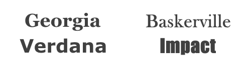
In general, limit the number of font families to a minimum (two is a lot, often one is enough) and stick to them throughout the website. If you are using more than one font, make sure the font families complement each other based on their character widths. Below is an example of font combinations. The combination of Georgia and Verdana (left) has similar meanings that create a harmonious mix. Compare this to a pair of Baskerville and Impact (right), where the heavy weight of the Impact typeface significantly overshadows the other typeface.
2. Try use standard fonts
Font embedding services (like Google Web Fonts or Typekit) have many cool fonts that can give your projects something new, fresh, and unexpected. They are also very easy to use. Take Google for example:
- Choose any font like Open Sans.
- Generate code and paste into your HTML document.
- Ready!
So what could go wrong?
In fact, this approach has one major problem - users are more familiar with standard fonts and can read them faster.
Unless your website has a specific need for a custom font, such as for branding purposes or to create an impressive experience, it is usually best to use system fonts. A safe bet is to use system fonts: Arial, Calibri, Trebuchet, etc. Keep in mind that good typography draws the reader towards the content, not the type itself.
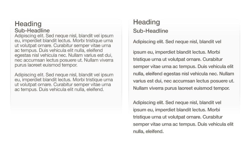
Having the correct number of characters on each line is the key to the readability of your text. It shouldn't be that your design dictates the width of the text to you. It should also be a matter of readability. Check out this tip for legibility and line length from:
“You should have about 60 characters per line if you want a good reading experience. Having the correct number of characters on each line is the key to the readability of your text. ”
 If the line is too short, the eye will have to come back too often, breaking the rhythm of the reader. If a line of text is too long, it will be difficult for the user to focus on the text. Image: Material Design
 For mobile devices, you must use 30-40 characters per line. Below is an example of two sites viewed on a mobile device. The first uses 50-75 characters per line (the optimal number of characters per line for printing and for a computer), and the second uses the optimal 30-40 characters.
 Image: Usertesting
 In web design, you can achieve the optimal number of characters per line by limiting the width of your text boxes using em (relative unit) or pixels.
4. Choose a font that works well in different sizes
Users will be able to access your site from devices with different screen sizes and resolutions. Most user interfaces require text elements of various sizes (button text, field labels, section headings, etc.). It's important to choose a font that works well in different sizes to ensure readability and usability at any size.

Make sure the font you choose can be legible on smaller screens! Try to avoid fonts that use italics, such as Vivaldi (in the example below): while beautiful, they are difficult to read.

In many fonts, it is too easy to confuse similar letter shapes, in particular “i” and “L” (as seen in the image below), and small letter spacing, such as when “r” and “n” look like “m”. Therefore, when choosing a font, be sure to test it in different contexts to make sure it doesn't cause problems for your users.

Text written entirely in capital letters - great in contexts that don't involve reading(such as acronyms or logos), but when your message is meant to be read, don't force your users to read capitalized text. As mentioned by Miles Tinker, in his landmark work Ease of Printing, entire uppercase text slows down significantly the speed of viewing and reading compared to lowercase.

In typography, we have a special term for the distance between two lines of text - leading or line spacing. By increasing the line spacing, you increase the vertical space between lines of text, generally improving readability in exchange for valuable screen space. Generally, for good readability, line spacing should be 30% larger than the character height.
 Well-chosen line spacing improves readability. Image: Microsoft
 It has been proven that the correct use of the space between paragraphs increases understanding by up to 20%, as noted by Dmitry Fadeev. Knowing how to use white space is about providing users with an easily digestible amount of content and then removing extraneous details.
 Left: Text with nearly overlapping lines. Right: Well-chosen spacing contributes to readability. Image: Apple
 8. Make sure you have sufficient color contrast
Do not use the same or similar colors for text and background. The more visible the text, the faster users can view and read it. The W3C recommends the following contrast ratios for text and text in an image:
- Small text should have a contrast ratio of at least 4.5: 1 in relation to the background.
- Large text (at 14 pt bold / 18 pt regular) should have a contrast ratio of at least 3: 1 in relation to the background.
 These lines of text do not follow the color contrast guidelines and are difficult to distinguish from background colors.
  These lines of text follow the color contrast guidelines and are easy to read against background colors.
 Once you have chosen a color, it is imperative that you test it with real users on most devices. If any of the tests show a problem reading your text, you can be sure that your users will have a similar problem.
Color blindness is a common condition, especially among men (8% of men are color blind), it is recommended to use other signals in addition to color to mark important information. Also, avoid using only red and green colors to convey information, as red and green color blindness is the most common form of color blindness.
readable, understandable and legible.
Typography exists to provide content
Typography should deliver content in a way that never adds cognitive load to the user.
Do you have your own typography tips for web design? Or would you like more information on the above issues? Let me know in the comments below!
Subscribe toUX Planet:
Friends!
In this article, I will continue to analyze the most common mistakes novice designers make.
Today we are going to talk about using fonts. Do you know how I can tell the difference between a beginner's and a professional's job? A beginner, as a rule, tries to demonstrate in his work everything that he has managed to learn. This manifests itself in the abundant use of different colors, all kinds of effects and, of course, numerous fonts in the same work. A professional designer, on the other hand, usually uses one, or at least two fonts in one project, as well as a limited color palette. And if one cannot do without graphic effects at all, then he tries to reduce their use to a minimum.
So, if rule number one for good design is building a modular grid (see article), then rule number two sounds like this: limit the number of fonts!
The minimum number of fonts promotes adherence and consistency in design... The less your work contains different styles and is replete with all kinds of colors and fonts, the more meaningful and professional it looks.
Most often, a designer chooses one font for a project. Moreover, the character of the chosen font must correspond to the creative idea or the mood of the design. For example, if we are making a brochure about a third-generation cell phone, then a light, modern sans-serif font is likely to suit us. But a booklet on the theme of an exhibition of the Impressionists in the Hermitage is more suitable for a classic, "firmly on their feet", serif typeface. In general, a successful selection of fonts is extremely important in the work of a designer, because the discrepancy between the character of the font and the idea and the nature of the project can ruin all the work in the bud.
Sometimes it is necessary to use an additional font. When working with two fonts, the first font accentuates the mood and character of the work and often gives it individuality. This font is used for headings and subheadings. Sometimes designers use unusual fonts for this purpose. This is not done for the sake of the pursuit of originality, but in order to highlight specific parts of the text by increasing the contrast in relation to the second more familiar font.
Since there are not so many headings in one work, the principle of contrast works flawlessly, especially since the headings are much larger than the main text.
The second font, as a rule, is more familiar to the eye and its task is not to attract the attention of the audience, but to perform a purely informative function. It should be easy to read and not tire the eyes. Newbies often make the mistake of creating large chunks of text with extravagant, hard-to-read typefaces. I also include the overwhelming majority of so-called "handwritten" fonts among such fonts. Fonts like these are great for, say, a small greeting card, but not for working with a lot of text.
Here are some examples of good font use:

As you can see, there are only two fonts used here. One for headings and one for body copy. This work looks elegant and consistent.
And here's a bad use of fonts:

Here I am deliberately using a few fancy fonts to give you a sense of the disharmony and inconsistency of this design. Don't use too many fonts in your work! There is nothing worse than a job where 8 different fonts are mixed, and even more extravagant and hard-to-read fonts.
Here's an example of how it works: 
This is not my fantasy. I have seen many such works, and they were usually done either by novice designers or amateurs.
If you check your design textbook, you will likely find guidelines to use sans serif for headings and serif for body text.
But this rule is too general and in practice it often has to be circumvented.
Therefore, in the end, one more little advice. If the headline font looks modern, then choose a sans-serif font as the main font. If your first font is old-fashioned, then the main font should be serif.
The topic of using fonts is inexhaustible, so it is impossible to cover everything in one small article. As far as possible, I will share with you my knowledge of working with fonts. By the way, in my training course on the Indesign program I pay a lot of attention to this important topic.

Communication plays a huge role in design. It is very important to create a strong connection between the website and the user himself, and then help him achieve his goals. When we talk about communication in the context of web design, we usually mean text. Typography is an integral part of this process:
More than 95% of information on the Internet is stored in writing.
Good typography is the key to easily accessible information, while bad typography has to work hard to understand the text. As Oliver Reichenstein notes in "Web Design Is 95% Typography":
Optimizing typography is about optimizing readability, accessibility, usability (!) And achieving graphic balance in general.
1. Use the minimum number of fonts
When using more than 3 different fonts, your website loses its structure and looks unprofessional. Remember, overuse of font size and style can mess up any markup.
To prevent this from happening, try to keep the number of fonts you use to a minimum.
In general, keep the number of fonts to a minimum (two is more than enough, often one is enough) and stick to using the same fonts throughout the website. If you choose to work with more than one font, make sure the font families match in terms of letter width. Take a look at the example below. The combination Georgia and Verdana (left) share common characteristics that allow them to blend in harmoniously with each other. Take the combination of Baskerville and Impact (right) for comparison. "Heavy" Impact overwhelms its "notch" partner.

Make sure the font families fit together in terms of letter width
2. Try to use standard fonts
Font services (such as Google Web Fonts or Typekit) have many interesting ones that add something new and different to your design. Plus, they're very easy to use. Take Google for example:
1. Choose any font. Let's say Open Sans.
2. Generate the code and paste it into
Your HTML.
3. Done!
But what could go wrong?
In fact, this method has one serious problem - users are accustomed to standard fonts and read text written in such fonts faster.
Usually the best solution is to use system fonts (Arial, Calibri, Trebuchet, etc.). An exception may be the need to stick to some type of font that the client has set himself: for example, for branding or to create something memorable. Remember that good typography affects the reading of the text, not the visual perception of the type.
3. Limit line length
The correct number of characters on one line is the key to the ease of reading of your text. When choosing the width of the text, you should focus not on your design, but on the clarity and legibility of the writing. Check out this tip from the Baymard Institute:
“If you want your reader to be comfortable, each line should be no more than 60 characters. The correct number of characters on one line is the key to the ease of reading of your text. "

If the line is too short, the eyes will have to change focus frequently, which will slow down the reading pace. If the line is too long, on the contrary, the reader's eyes will have to focus on the written for a long time. Photo: Material Design
For mobile devices, stick to a range of 30-40 characters per line. Below is an example of two sites open on mobile devices. One line contains from 50 to 75 characters (the best number of characters per line for printed text and computer resolution), and on the second, we see the optimal 30-40 characters.

In web design, you can achieve the required number of characters by reducing the width of text boxes using em or pixels.
4. Choose typefaces that read well in any size
Users will visit your site from different devices, which, accordingly, have different sizes and resolutions. Most user interfaces use text elements of various sizes (copy button, field labels, section headers, etc.). Choose a typeface that looks good and remains readable at any size.

Roboto by Google
Make sure the headset you choose is easy to read on small screens! Try not to use italic fonts like Vivaldi (pictured below): while they look pretty, they can be difficult to understand.

Using the Vivaldi font will make it harder to read text on a small screen
5. Use fonts with crisp letters
Many typefaces are designed in such a way that it is sometimes very easy to confuse similar letters, especially the Latin "I" and "L" (as in the image below). In some, the letters are so close to each other that the combination of "r" and "n" can be mistaken for the letter "m". Therefore, when choosing a font, test it in different contexts. This way you can make sure that the typeface doesn't make the reader understand the text.

6. Avoid caps
Text written in caps - or in capital letters alone - is suitable for a situation where the user is not involved in the reading process (for example, in abbreviations or logos). But in other cases, don't rape your readers with all caps. As Miles Tinker notes in his famous work "Legibility of Print," such text reads much slower than lowercase text.

7. Don't keep the line spacing to a minimum
In typography, there is a special term for the spacing between lines - leading (or line spacing). By increasing the leading, you increase the vertical space between lines, thereby improving the readability of text on the screen. According to the rules, to ensure readability of the text, the leading should be about 30% more than the height of the character.

Correct line spacing contributes to better readability of the text. Photo: Microsoft
According to Dmitry Fadeev, the correct distance between paragraphs increases reading comprehension by 20%. The designer's ability to work with white space allows users to assimilate the content of the text in its entirety without missing out on any details.

Left: The text was written almost back to back. Right: Correct line spacing makes the text easier to read. Photo: Apple
8. Make sure your color contrast is okay.
Do not use the same or similar colors for text and background. The better the text is visible, the faster users will be able to read it and catch the main points. The World Wide Web Consortium advises using the following ratio for body text and image text:
- Small texts should have a contrast ratio of at least 4.5: 1 in relation to the background.
- Large texts (from size 14 in bold / from size 18 and above in standard font) must have a contrast ratio of at least 3: 1 in relation to the background.

This text does not meet the color contrast standard and is therefore difficult to distinguish against the background.

This text follows the color contrast standard so it is easy to read.
When you have chosen the color scheme, you need to make your text readable by real users and preferably on several different devices. If during testing some difficulties with text recognition are revealed, then you can be sure that in the future many users may face the same problem.
9. Try not to use red or green in the text
Color blindness is a fairly common phenomenon, especially among men (8% of the male population is color blind). Therefore, in addition to color, it is advisable to use some other signs to highlight important information. Also, try not to resort to red and green colors, as these are the colors most often not recognized by color blind people.
10. Try not to use flickering text
Information that blinks or flickers can cause discomfort in susceptible users. In addition to discomfort, it can also irritate many readers, as it will distract them from the reading process.
Don't use flickering text!
Conclusion
Typography is a very important thing. By making the right choices, you endow the website with clarity and legibility. At the same time, the wrong choice can lead to inattentive reading of the text, as it distracts all attention to oneself. Typography should be readable, clear, and understandable.
Typography must be respectful of content
This implies that the reader should never feel discomfort while reading the text.
With the advent of personal computers and the first desktop publishing systems, typography has undergone a tectonic shift, the consequences of which are only now becoming visible. This is far from the first major change in typography, and there have been others. Suffice it to recall the time when the machines of the industrial world triumphed over artisans. Mass production and profit are more important than the beauty of type. Quantity mattered more than quality.
Great masters stopped creating new fonts - those that already existed were suitable for printing books. Craftsmen, no matter how professional they are, were left idle and became part of the technological process.
However, the victory of industrialism did not mean that the great masters disappeared with the advent of printing presses. These two worlds continued to exist independently of each other - printers recognized the talent of artisans, and they, in turn, understood that progress could not be stopped. This was the second change in typography, as a result of which it lost part of its "soul" or, if I may say so, humanity. But to understand what happened very recently, you have to travel back in time 500 years ago and find out how it all began.
FIRST TRANSITION
The first conflict between the new and the old arose after the invention of the first printing press. Its creator, Johannes Gutenberg, could use the machine to create a wide variety of compositions, with print speeds of up to 240 pages per hour. It was a revolution.
Before that, all books were created entirely by hand. The tomes of the past were handwritten and decorated with intricate designs and ornaments. The copying process was very long, but as a result, any book, even a copy, was a work of art.

Of course, the first printed books could not be compared to handwritten ones. They were not very beautiful, but they were smaller and cheaper. And most importantly: the ability to replace individual characters and entire font families made it possible to print books not only in Latin, but also in other European languages.
People welcomed these changes. They needed books in a language they could understand and books to take with them. They had a thirst for knowledge and printed books quenched it.
However, as a result of the first transition, the book lost much of its humanity. The machines took over the main process, but the craftsmen were still in demand. Each letter was cut by hand, and the design and illustrations were also created by people. However, very little time will pass and the skill will begin to leave the book production process.
DIGITAL AGE
The first crossing destroyed the handwritten books. Industrialization finally deprived the seal of humanity, everything became mechanized and artisans were left out of work. But the third transition finally finished off typography as an art. Most typefaces these days are surprisingly featureless. It's just a bunch of fonts on your computer. Hardly anyone knows the history of this or that font. Nobody cares before. We scroll through hundreds of fonts in a minute looking for a suitable font, and everything else is not that important.
_______________________
“In our highly computerized world, the proliferation of type and its variety of variations represents a new level of visual pollution that directly threatens our culture,” says designer Massimo Vignelli. "Out of the thousands of fonts, we only need a few basic ones, because the rest is just rubbish."
_______________________
In some ways he is right. Typography isn't just fonts. It’s not only beautiful letters, it’s something different, something that makes us feel. Basically, typography is a message. According to the famous Russian typographer Lazar Lissitzky, typography should optically convey to the reader the same idea that the speaker voices with his voice. "
A long time ago, no one writes with a stylus on parchment. Rough paper that smells of ink is a thing of the past. The glossy print market has shrunk to microscopic proportions. Today we read texts that were not printed, but typed, and we read them not on paper at all. And, apparently, another transition awaits typography. What it will be, no one knows, but, most likely, following the paper, the displays we are used to will become obsolete. It is difficult to say when a new revolution will take place, but there will certainly be a new transition.
The saddest thing about all this is that people have lost part of themselves in the pursuit of perfection. Practically no one needs the skill of calligraphy today. It takes a long time, it requires care and perseverance. This makes no sense today - there are headsets for every taste. We choose fonts like zombies: name, size, style ... Message? Message? There is no message behind computer fonts, no history, nothing.
NOSTALGIA OF THE PAST
Today, many designers feel the need for new typefaces that would give the text that much needed personality. There are many ways to work with typography, each with the same goal of moving away from the facelessness of digital typefaces. Everything is used - color contrast, illusion of volume, negative space, in a word, everything that can turn a standard font into a slightly less standard one.

And in this regard, we can note three trends that are gaining strength, which demonstrate the desire of designers to restore the lost authenticity to fonts. There are only three main trends in typography, but they are hard to miss, as they appear literally everywhere. We are talking about styles such as retro, watercolor and caps.
VINTAGE GRANDGE PRINTING
One of the most common design woes is the problem with.
In this article, we'll share a few principles of good typography and give you tips on how to avoid many common mistakes.
This article is not a book on typography or the art of typography, it is more like "quick tips to improve the type design foundation."
Rule 1. The smaller the fonts, the better
One of the biggest mistakes designers make is using too many fonts and / or styles. Try to bring them down to two or three. That is, the main text should be of the same font and size.
Pick one for the headings and stick with it, maybe as a last resort, another one for the subheadings. Don't be afraid if the fonts are very different from each other. When using two very similar fonts in your design, the reader might think that you just made a mistake and accidentally chose the wrong font when typing.
Take care of the consistency of color, density, etc. or your text will look like drunken flies scattered all over the page.
Rule 2. Watch out for discharge
Be careful not to overshoot the letters. If you have problems with a lack of space for the text, then it is better to reduce the font. Yes, it may add space between paragraphs, but there is nothing to worry about, it will give some breathing space when reading.

Rule 3. Correct alignment
Please do not center everything (unless this is a special design move). Consider using a grid. After all, everything on the page is interconnected. Use guidelines and place objects according to them. Don't scatter objects at the corners of the page as if you couldn't decide where to place them.

Rule 4. Less decorative fonts
Do you have beautiful decorative fonts? Wonderful! But this does not mean at all that it is necessary to use them for the text of paragraphs. Behind decorative fonts, most often there is a story, or they are used in a specific case, for example, for a heading or title. Oftentimes, the simpler the better, which is why fonts like Helvetica are so popular.

Rule 5. Size matters
It's about the size of the letters of the text;). Headings are fine when typed in bold and large type, but if you use too large letters in the body text, it will make it cheaper. Think about it. You go to a good restaurant and it often happens that the menu is written in small print, it looks cool. (Just make sure the font isn't small enough to be hard to read.) Don't be afraid to make your headlines much larger than your body copy.

Rule 6. Watch for readability
Everything you do is done so that it can be read. Dark text on a dark background is not a good idea. Worse still, placing small text over a high contrast photo. Remember to avoid placing text over anything.

Rule 7. Choose the right colors
What color is best for the font? Generally, believe it or not, black or white is often best. If you are using a color other than different shades of gray, lower the saturation. Brightly colored type can be difficult to read. Beware of complex vibrating combinations like red on green.

Rule 8. Suitable grouping
Related pieces of information are best combined together. This will make the design clearer. For example: look at a movie poster, all the data is grouped into attractive blocks. They can now be seen as a separate design element. Examples of bad grouping - open the yellow pages.

Rule 9. Sufficient Leading
This is the distance between lines of text. It is very important to choose the right interval. It is much more enjoyable to read when there is room to rest the eyes between the lines. As a general rule, try to use leading at least 2 points larger than the font size. For example: for maximum readability at 10pt the font should be set to at least 12pt.

Rule 10. Watch out for kerning
Kerning is the spacing between individual characters of a word. It is important to have experience in identifying bad kerning, since often programs, such as Photoshop, make mistakes in its placement. This will need to be adjusted manually, but the main thing is not to overdo it. If you don't like character spacing, but are not sure how to improve it, choose a different font.

Try these rules when working with type. Well-designed type blocks should look good without any images. At its best, your type work reinforces a positive design experience. It should be attractive and easy to read.